From Saturday 19th March until Monday 2nd May. (2011)

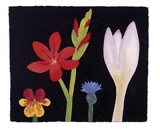
In the DLI (Durham Light Infantry) art gallery there’s a retrospective exhibition of Nerys Johnson’s work between 1970 and 1989. The exhibition looks at the progression of Nerys’ style by focusing on the work that she based on three types of flowers; Tulips, Lilies and Sunflowers. Nerys was terribly affected by arthritis since she was a child and sadly died following an operation in 2001. She said that flowers were a major source of inspiration for her work because “They grow, change, decay and metamorphose.”
Running alongside the Nerys Johnson exhibition is Aether and Hemera’s “The Colour of Phi” This is a light installation of coloured wires crossing over and creating patterns in the light. The light pattern is based on the Golden Ratio which is used by architects, artists and designers but is also found in flower petals and pine cones. Aether and Hemera (more commonly known as Claudio and Gloria) are both Italian and, now based in North-east England, they specialise in new media and lighting.
Nerys’ style is very strong, it looks like she dived into her paintings without looking where she was going and it just worked. The thick stalks of the plants and the bright colours made her paintings seem child-like but they were done very skilfully, she seemed to know exactly when to finish painting, without adding neeless finishing touches that often spoil contemporary work. I thought the film of Nerys painting and talking about her art was very eye opening, I didn’t know very much about Nerys before yesterday but I felt like I got to know her though her work.
On it’s own, I loved Aether and Hemera’s piece. It was intriguing and I stared at it for ages because it felt as if it was moving though it was still or like it was flashing even though the light was constant. Using the Golden Ratio couldn’t have made this piece any easier to make! Everything seemed very precise and I was impressed by the piece, though it would have been much stronger if the room was darker, a black sheet draped over the door would have sufficed...
Individually I liked most of Nerys’ work but I think that if the whole show was curated differently it could have been really amazing. Nerys’ work was packed onto the walls, this didn’t compliment her style which is immature and childish yet boldly confident with a clear idea. With all of the work crammed into the walls it made the pieces weaker and less striking. Nerys herself used to curate exhibitions in a similar style but I think she took more care in which pieces were on the line that you pay most attention to. It would have been really brave and bold if the curator had gone against Nerys’ curating style and put only a few amazing pieces in the exhibition or played with the composition. Nerys’ playful art could have been been reflected in the way that it was put on the walls but sadly, it wasn’t and it seemed to make the individual pieces less special.
Also, the link between the two exhibitions seems strained, Nerys painted and drew flowers and the light was constructed like the golden ratio of a petal’s anatomy. In my oppinion, it’s a great shame that the two shows weren’t more integrated as they could have really complimented each other.
I felt quite out of place in the gallery space as it felt more like going to a church coffee morning than the opening of a new art show. The old socks-and-sandals crowd agitated me. It seemed as if they were more bothered by the free coffee and cakes than the skill of the artists. The adjective “marvellous” was extremely overused and a woman actually commented that I “lower the average age of this gathering by about 20%!” With a bit of advertising around Durham university or some cafes there would have been some more young people who would have probably used more interesting adjectives than “marvellous!”
Nerys’ work: 3/5
Aether and Hermera’s work: 4/5
Curating: 1/5
Gallery: 2.5/5
Overall enjoyment: 55%


No comments:
Post a Comment